Typography
Typography and Font Usage
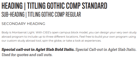
New Print System

Heading
- Highly versatile grotesque compressed san serif with extended versions for print and web
- Maintains aspect ratio of Knockout
Subheading
- Wide, circular letter forms; crisp and clear at all sizes
- Less corporate; more casual, fun and student focused
- Equally successful in print and web
Special call out
- Unique expressive slab serif
- Modern and hip; bursting with personality
- Speaks to the educational and human aspects of CIEE
- Extra "special" - strong contrast allow it to standout
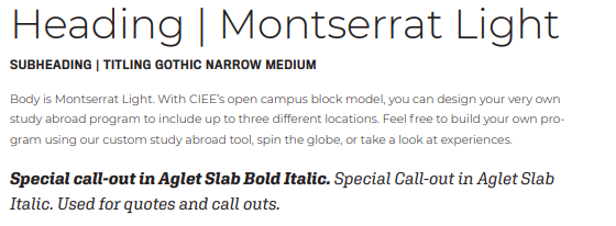
New Web System

- Font families applied to both print and web creates brand unity
- Combination of three families feels dynamic and varied
- More personal and humanistic
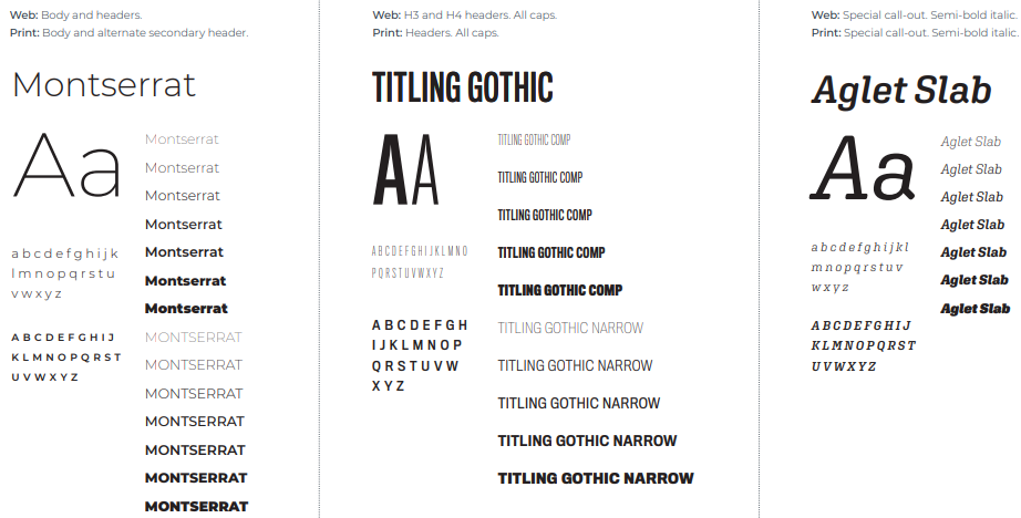
Font Specimens
Meet our new font families; they play well together and have great range. 
Alternative Fonts
If our primary fonts cannot be used and you must use the alternative fonts, setting Arial headlines in all caps can help capture the look of CIEE typography. Set Calibri in upper- and lowercase.
Alternative for Titling Gothic
- Arial Regular
Alternative for Montserrat
- Calibri Regular
- Calibri Italic
- Calibri Bold
- Calibri Bold Italic